جاوا اسکریپت غیر فعال است برای تجربه بهتر، قبل از ادامه، جاوا اسکریپت را در مرورگر خود فعال کنید.
You are using an out of date browser. It may not display this or other websites correctly.
You should upgrade or use an
alternative browser .
آموزش کامل Excel 2007 - EN
Lesson 3: Creating Excel Functions, Filling Cells, and Printing
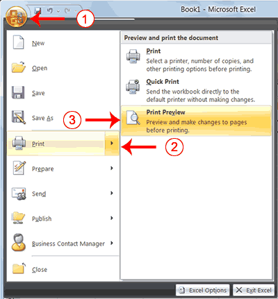
[h=4]Open Print Preview
Click the Office button. A menu appears.
Highlight Print. The Preview and Print The Document pane appears.
Click Print Preview. The Print Preview window appears, with your document in the center.
Lesson 3: Creating Excel Functions, Filling Cells, and Printing
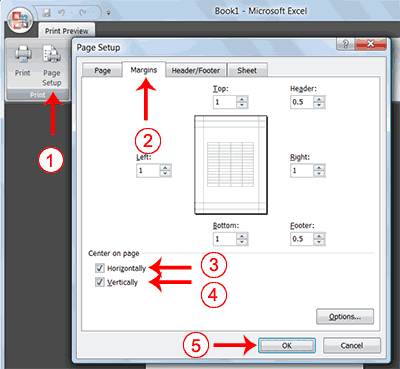
[h=4]Center Your Document
Click the Page Setup button in the Print group. The Page Setup dialog box appears.
Choose the Margins tab.
Click the Horizontally check box. Excel centers your data horizontally.
Click the Vertically check box. Excel centers your data vertically.
Click OK. The Page Setup dialog box closes.
Lesson 3: Creating Excel Functions, Filling Cells, and Printing
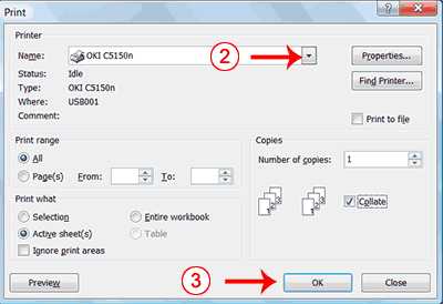
[h=4]Print-2
Click the Print button. The Print dialog box appears.
Click the down arrow next to the name field and select the printer to which you want to print.
Click OK. Excel sends your worksheet to the printer.
This is the end of Lesson 3. You can save and close your file.
[h=2]Lesson 4: Creating Charts
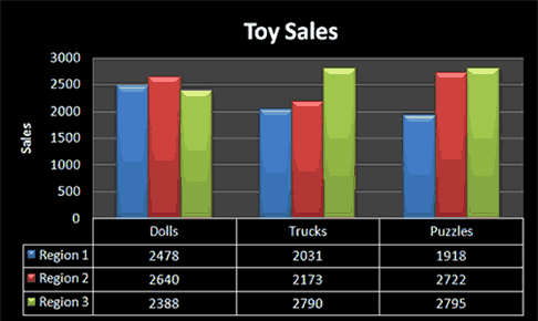
[h=3]Create a Chart
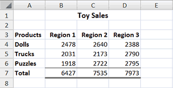
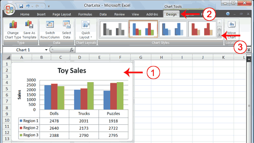
To create the column chart shown above, start by creating the worksheet below exactly as shown.
After you have created the worksheet, you are ready to create your chart.
Lesson 4: Creating Charts
[h=4]
EXERCISE 1
[h=4]Create a Column Chart
[h=4].
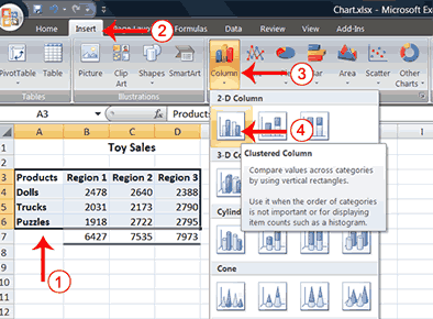
Select cells A3 to D6. You must select all the cells containing the data you want in your chart. You should also include the data labels.
Choose the Insert tab.
Click the Column button in the Charts group. A list of column chart sub-types types appears.
Click the Clustered Column chart sub-type. Excel creates a Clustered Column chart and the Chart Tools context tabs appear.
[h=3]Apply a Chart Layout
Context tabs are tabs that only appear when you need them. Called Chart Tools, there are three chart
Lesson 4: Creating Charts
[h=4]
EXERCISE 2
[h=4]Apply a Chart Layout
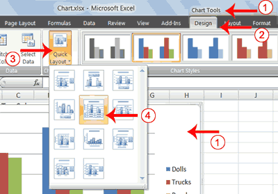
Click your chart. The Chart Tools become available.
Choose the Design tab.
Click the Quick Layout button in the Chart Layout group. A list of chart layouts appears.
Click Layout 5. Excel applies the layout to your chart.
Lesson 4: Creating Charts
Lesson 4: Creating Charts
[h=4]
EXERCISE 3
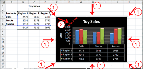
[h=4]Add labels
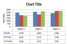
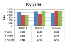
Select Chart Title. Click on Chart Title and then place your cursor before the C in Chart and hold down the Shift key while you use the right arrow key to highlight the words Chart Title.
Type Toy Sales . Excel adds your title.
Select Axis Title. Click on Axis Title. Place your cursor before the A in Axis. Hold down the Shift key while you use the right arrow key to highlight the words Axis Title.
Type Sales. Excel labels the axis.
Click anywhere on the chart to end your entry.
Lesson 4: Creating Charts
Lesson 4: Creating Charts
[h=4]
EXERCISE 4
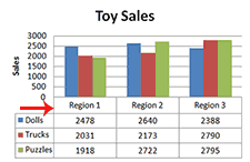
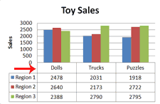
[h=4]Switch Data
Click your chart. The Chart Tools become available.
Choose the Design tab.
Click the Switch Row/Column button in the Data group. Excel changes the data in your chart.
Lesson 4: Creating Charts
Lesson 4: Creating Charts
[h=4]
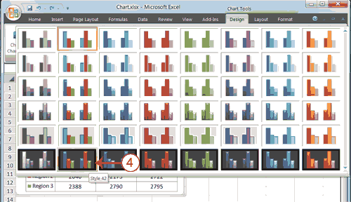
EXERCISE 5
[h=4]Change the Style of a Chart
Click your chart. The Chart Tools become available.
Choose the Design tab.
Click the More button
in the Chart Styles group. The chart styles appear.
Click Style 42. Excel applies the style to your chart.
Lesson 4: Creating Charts
Lesson 4: Creating Charts
[h=4]
EXERCISE 6
[h=4]Change the Size and Position of a Chart
Use the handles to adjust the size of your chart.
Click an unused portion of the chart and drag to position the chart beside the data.
Lesson 4: Creating Charts
Lesson 4: Creating Charts
[h=4]
EXERCISE 7
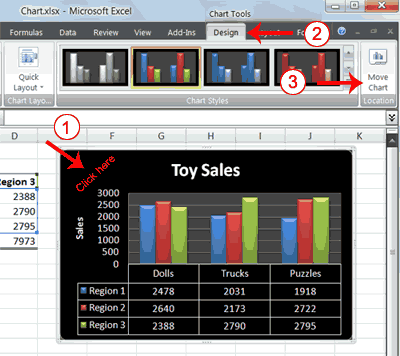
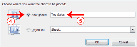
[h=4]Move a Chart to a Chart Sheet
Click your chart. The Chart Tools become available.
Choose the Design tab.
Click the Move Chart button in the Location group. The Move Chart dialog box appears.
Click the New Sheet radio button.
Type Toy Sales to name the chart sheet. Excel creates a chart sheet named Toy Sales and places your chart on it.
Lesson 4: Creating Charts
Lesson 4: Creating Charts
[h=4]
EXERCISE 8
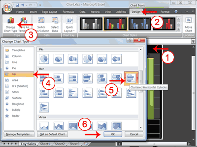
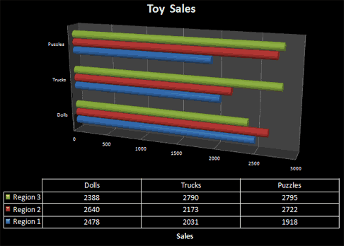
[h=4]Change the Chart Type
Click your chart. The Chart Tools become available.
Choose the Design tab.
Click Change Chart Type in the Type group. The Chart Type dialog box appears.
Click Bar.
Click Clustered Horizontal Cylinder.
Click OK. Excel changes your chart type.
You have reached the end of Lesson 4. You can save and close your file.